Tile trends come and go, but the best bathrooms still share the same feeling: calm, intentional, and beautifully finished. For 2026, we are seeing a shift toward warmer tones, tactile surfaces, and layouts that feel more considered than busy.
Below are the trends we would bet on this year, plus practical “how to use it” tips so your bathroom looks premium long after the trend cycle moves on.
Tip: Use your own Bathroom People project photos wherever possible for maximum trust.
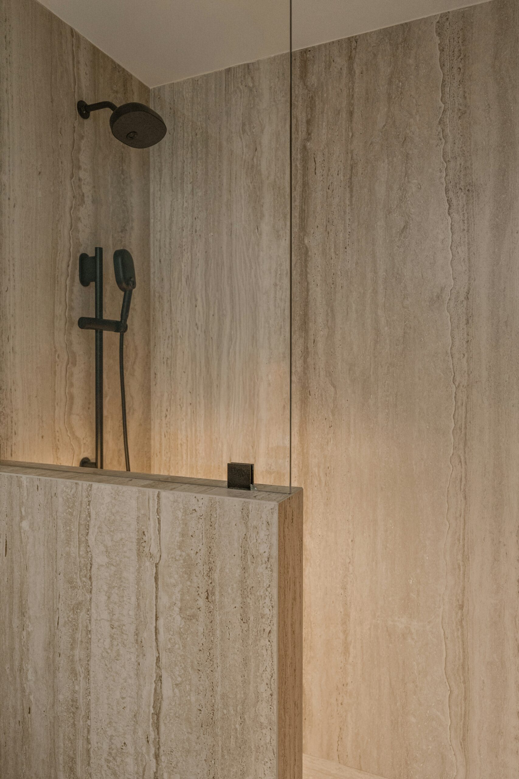
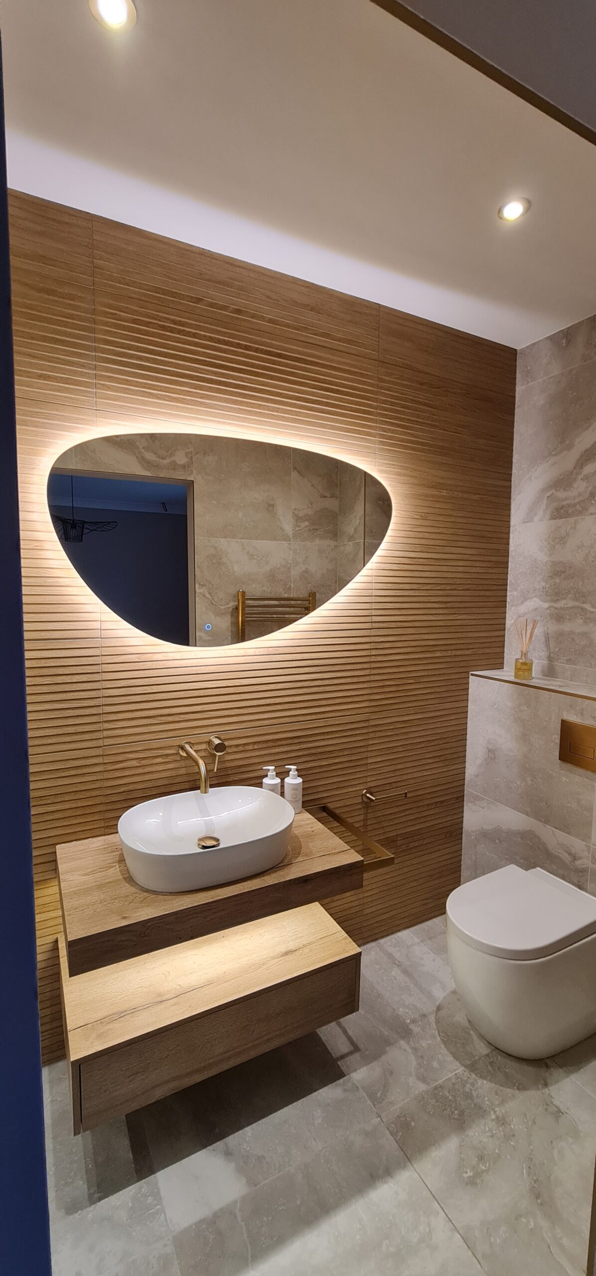
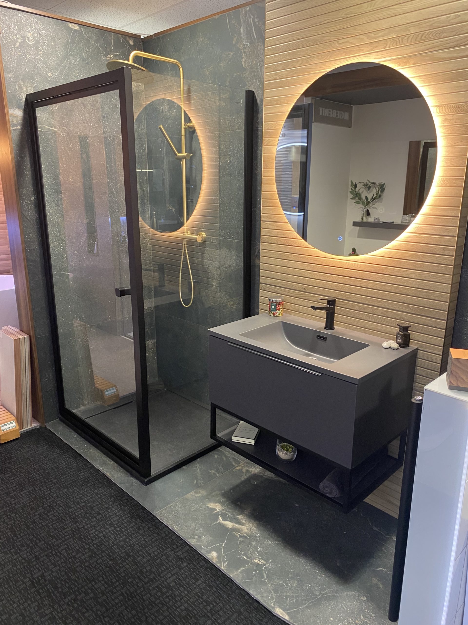
Warm stone and travertine looks
Softer beige, sand, and creamy stone tones are replacing colder greys. The look is calmer, warmer, and expensive in real life.
How to use it ⌄
- Pair with brushed brass or warm nickel for a quiet luxury finish.
- Use large format on walls to reduce grout lines and visual noise.
- Keep the palette tight and let texture do the work.
Large format and low grout drama
Bigger tiles, fewer grout lines, and cleaner geometry. The result feels more architectural and premium.
How to use it ⌄
- Match grout tone to tile colour for a seamless look.
- Use on feature walls behind the vanity for a slab like effect.
- Plan lighting early so textures don’t look flat.
Handmade look gloss done properly
Think zellige style tiles, gentle variation, soft shine. It adds character without looking chaotic.
How to use it ⌄
- Keep the rest of the room simple so the tile can be the hero.
- Use in shower niches, splashbacks, or one feature wall.
- Warm lighting makes the glaze look richer and less clinical.
Fluted, ribbed, and 3D textures
Tactile surfaces are big for 2026. They create depth even in quiet, neutral schemes.
How to use it ⌄
- Use on a single wall to avoid visual overload.
- Angle lighting across the texture for a high end shadow effect.
- Pair with matte paint or stone looks to keep it grounded.
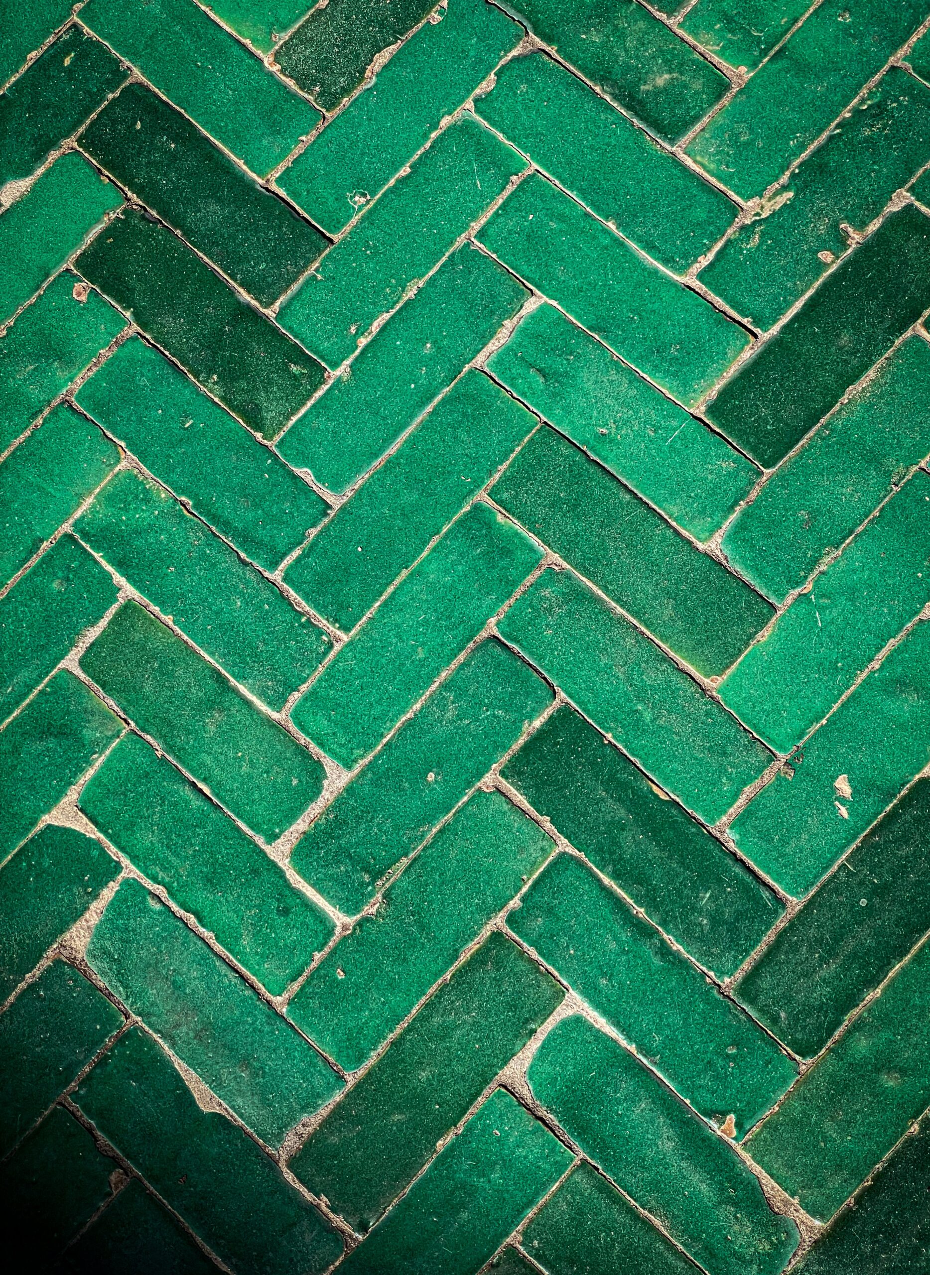
Pattern, but make it subtle
Checkerboard and small pattern is back, but toned down. Think soft contrast, not loud contrast.
How to use it ⌄
- Keep patterns mainly to floors, then calm walls above.
- Use warm neutrals instead of stark black and white.
- Choose one statement element, not five.
Plaster and microcement looks
A soft, seamless look that feels calm and modern. Great for spa bathrooms and minimalist schemes.
How to use it ⌄
- Prioritise correct prep and waterproofing behind the finish.
- Layer lighting to avoid the surface looking flat.
- Warm metals and timber tones balance the minimal look.
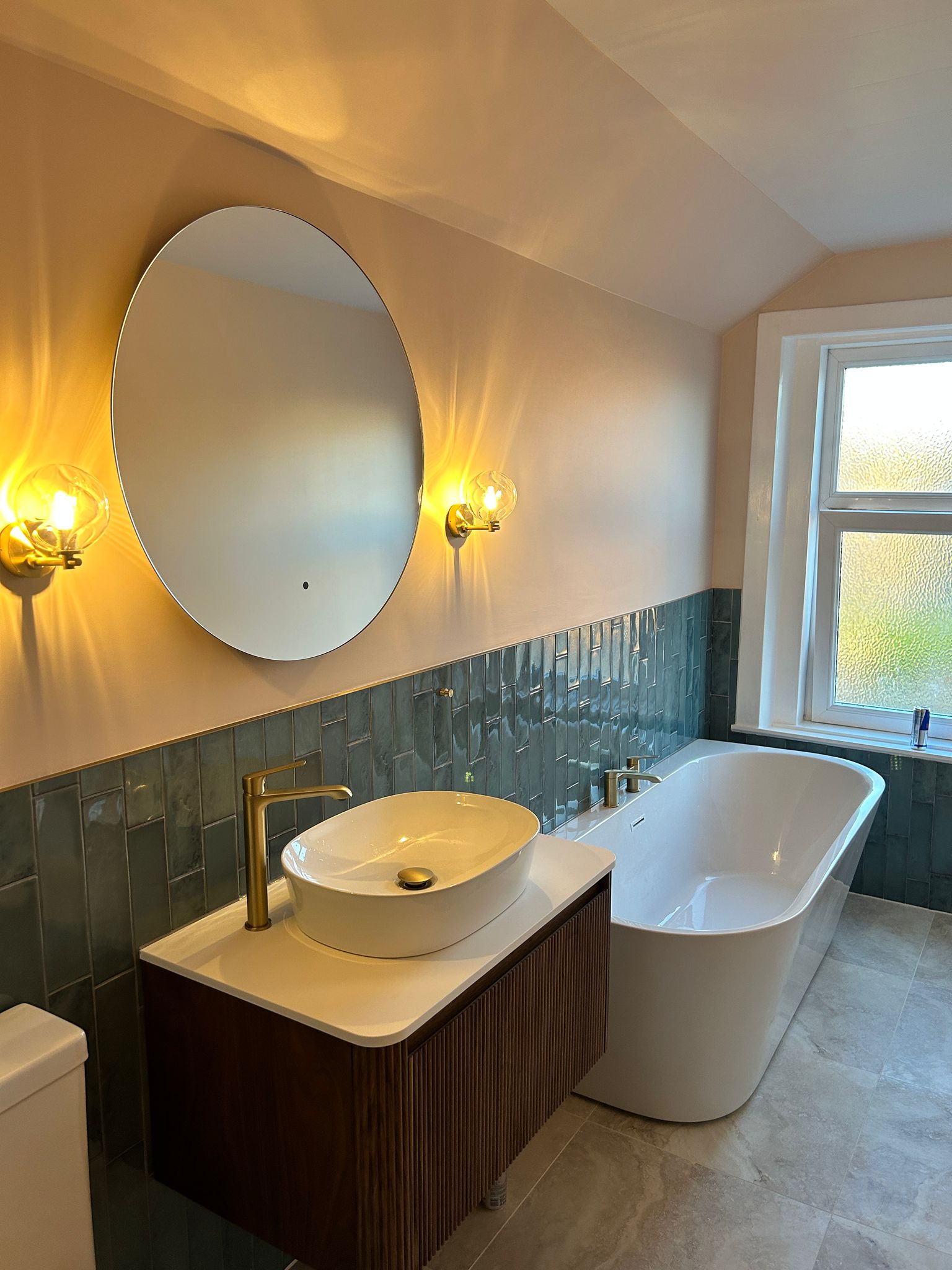
Earthy palettes and deep greens
Greens stay, but in richer, earthier tones. Think forest, olive, moss, and softened sage.
How to use it ⌄
- Use green as an accent wall or niche rather than everywhere.
- Balance with warm stone and off white to keep it timeless.
- Brushed brass looks especially premium with these tones.
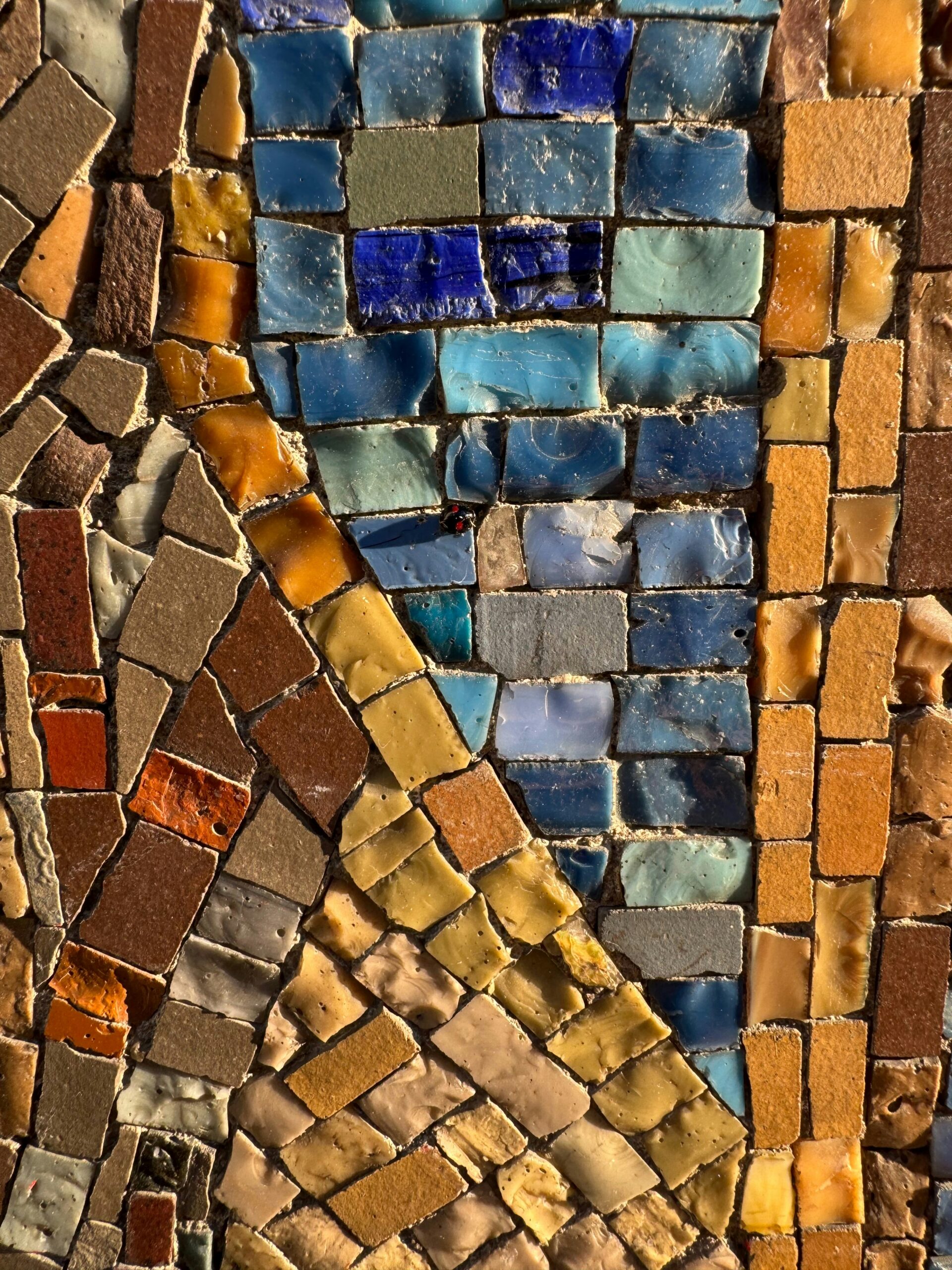
Mosaics used like jewellery
Mosaics are staying, but used in smaller moments. Niches, shower floors, and feature strips look most premium.
How to use it ⌄
- Keep mosaics to one zone so the room still feels calm.
- Pick tones that tie into the main tile, not compete with it.
- Consider lighting inside niches for a boutique feel.
Want help choosing tiles that feel timeless
Trends are useful, but the real goal is a bathroom that still feels premium in five to ten years. If you want help narrowing options, pairing finishes, and planning the full look properly, we can guide you through it in the showroom.
Book an appointment or enquire